This is an article about creating a custom form element for building filters. It blends several controls into one, limiting state changes to the most useful ones. Before going more into the details, let’s talk about the context.
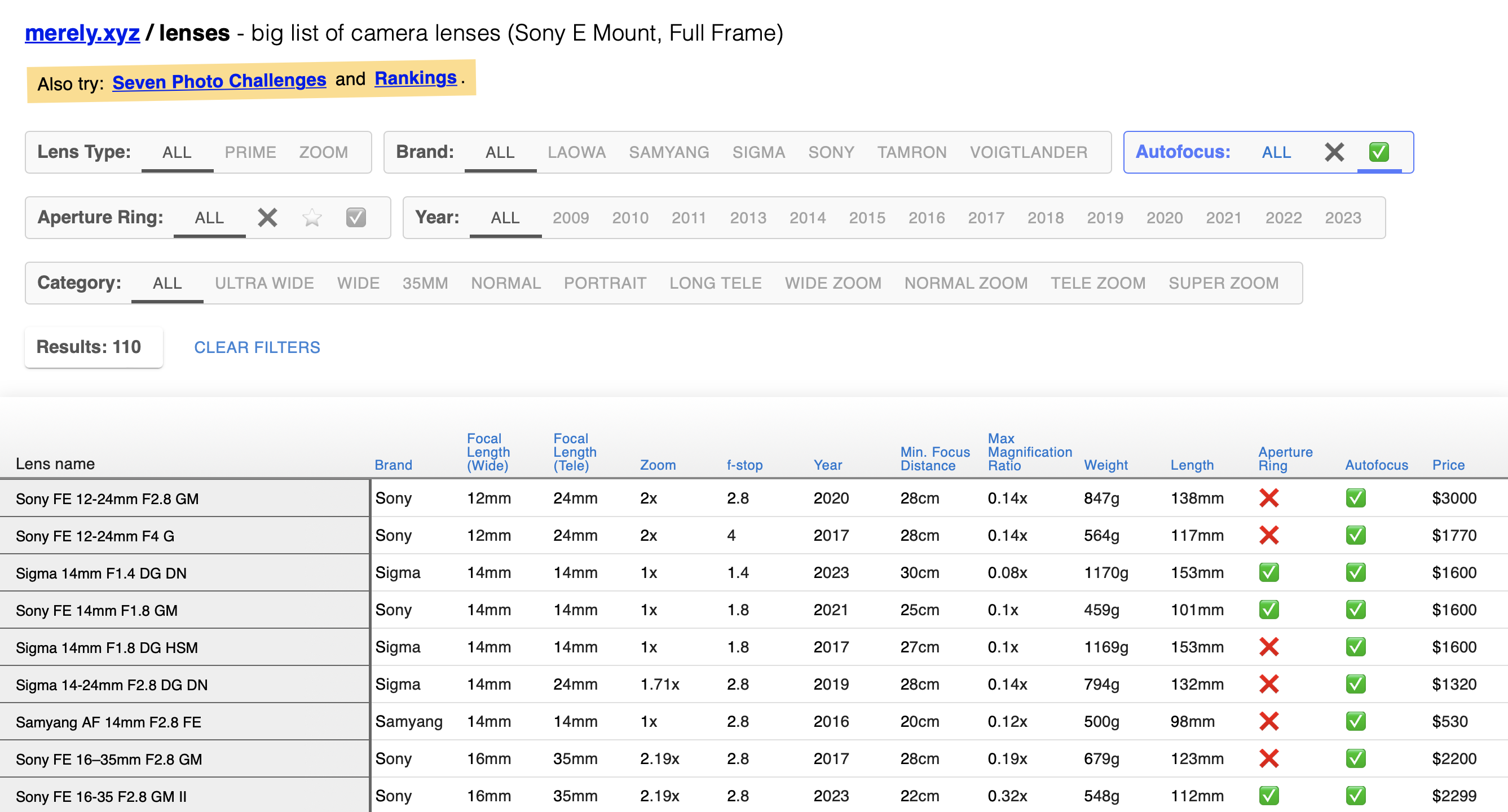
A while ago I started building a large dataset of camera lenses in the form of a sortable data grid. At some point I wanted to add support for filtering.
My filters should allow toggling booleans, selecting multiple options from a set, as well as providing some status indication to the user. To make the UI simpler and less distracting, I wanted to handle that with a single kind of form element. I also wanted UI that is intuitive and touch friendly.
For maximum flexibility and maximum fun I decided to build something custom.
This project is unusual compared to most other lens directories because its data processing logic, like sorting and filtering, happens on the client and not on the server. This feels revolutionary — there is no need to wait for the server response after each query, which offers a dramatic speed improvement1. The difference is even more pronounced when working with data that has a lot of “properties” (columns). At the same time, the concept is as old as spreadsheets and databases, which can be efficient but not the most intuitive or user friendly.
Still, I can’t help but wish that consumer facing websites, like online stores or news platforms, copied their data to the client for fast and flexible data processing2.
Could we design a website with the efficiency of a spreadsheet that is as intuitive as a modern online store? Let’s start with that custom filtering element.
I chose to approach this in an explorative way. Meaning that as the project grows, I’m adding filtering features and expanding them to cover new requirements. During that time I’m prioritizing good UX on both desktop and mobile. This is a continuous and ongoing process, but I’m already seeing results that are useful for me. Here I wanted to share them.
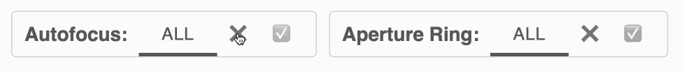
The current version of this form element is: a list of all options,
with an extra “All” button, an “Empty” state
and support for toggling. Here’s how it works:
"Empty" state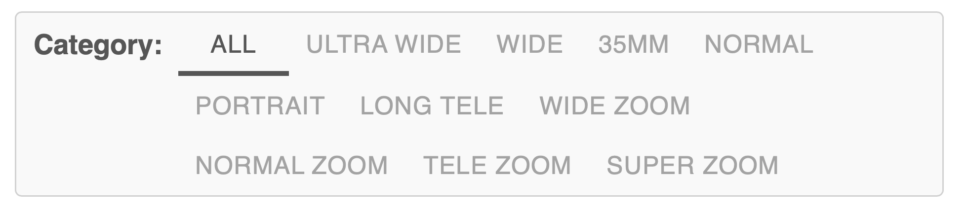
The element starts in the "Empty" state by default. In
that state both the element and all of its options are greyed out.
Still, in the "Empty" state all options are considered
selected.
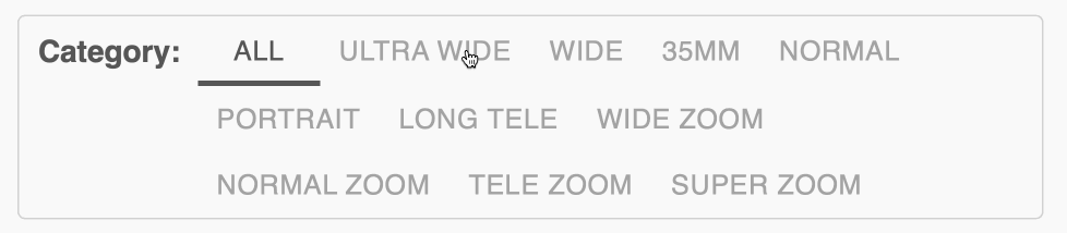
The example shows the element displaying a number of camera lens categories, every option is visible.
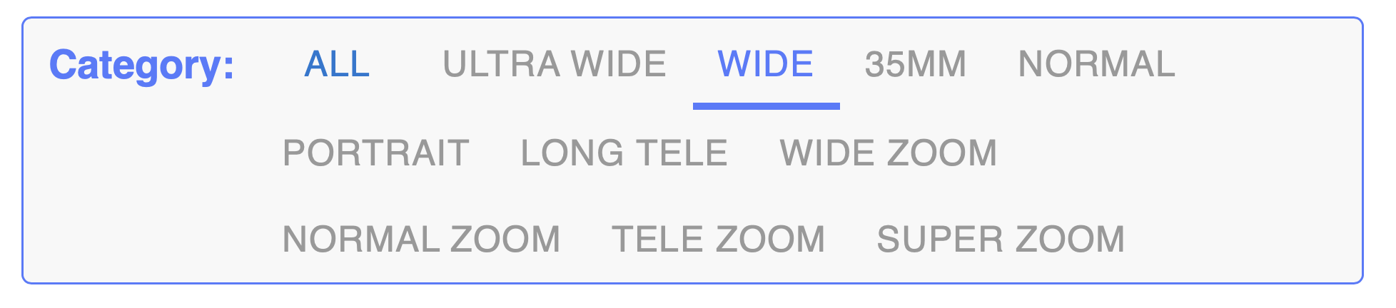
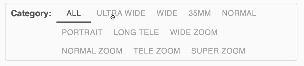
When the user clicks an option, all other options get deselected and
the element exits the "Empty" state. The selected option
gets highlighted and the whole element changes too, to indicate that
it’s no longer in the "Empty" state.
When the user clicks multiple options, one after another, then all of the options that have been clicked are now selected.
When only one option is left not selected and the user clicks it, then the clicked option gets selected and the rest gets deselected.
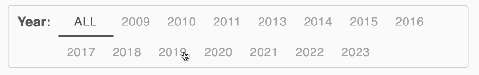
Range is handled as a subset of multiselect: the user is presented with a list of values and should choose those that are relevant to them.
This might not work for all use cases, but for a limited set of data (in my case: years from 2009 to 2023), this works well.
"All" button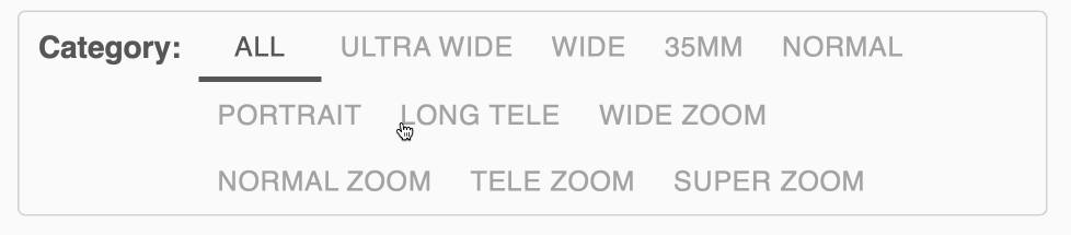
Pressing the "All" button an any point selects all
options and returns the element to the "Empty" state.
We’ll model the element’s behavior using three states: A.
"Empty", B. one option selected, and C. multiple options
selected.
"Empty"
When the element is in the "Empty" state, the only
action that can change the element’s state is selecting one of the
options.

From “One selected”, the state can change to both
"Empty" and “Multiple selected”.
Note that there is no difference between deselecting the last
selected option (*) and clicking "All" button (**). Both
result in a transition to the "Empty" state, where all
options are selected.
There is no state where no option is selected — this would be undesirable in the context of filtering, since it would always lead to returning an empty result set.

Similarly, from “Multiple selected”, the state can change to both
"Empty" and “One selected”.
There’s one quirk here: the toggling feature (***) works for elements with more than two options too. So when multiple options are selected and the user selects the last available option, the element toggles the state of all options.
This behavior, while intuitive for just two options (see the Booleans section above), can be unintuitive in this context.
Other possibilities are not perfect either. Limiting toggling to
elements with at most two options could be seen as inconsistent. Also,
selecting all options after clicking the last remaining option would
result in an abrupt transition to the "Empty" state, which
could be confusing too. This is one of the drawbacks of this element.
Can it be improved?
This is just a concept, with rough areas like the one mentioned above, or many others. There is more work to be done, including: adding support for different input options, improving the look and alignment, supporting more use cases, for example, adding descriptions to options — and we have not talked about any code yet.
I’ll be looking into that as the https://merely.xyz/lenses website grows. I write about my progress on this personal website, or on my Mastodon account at: mastodon.online/@merelyrandom — follow me there if you’re interested in updates.
I hope you enjoyed this exploration, see you in the next post!